Overview
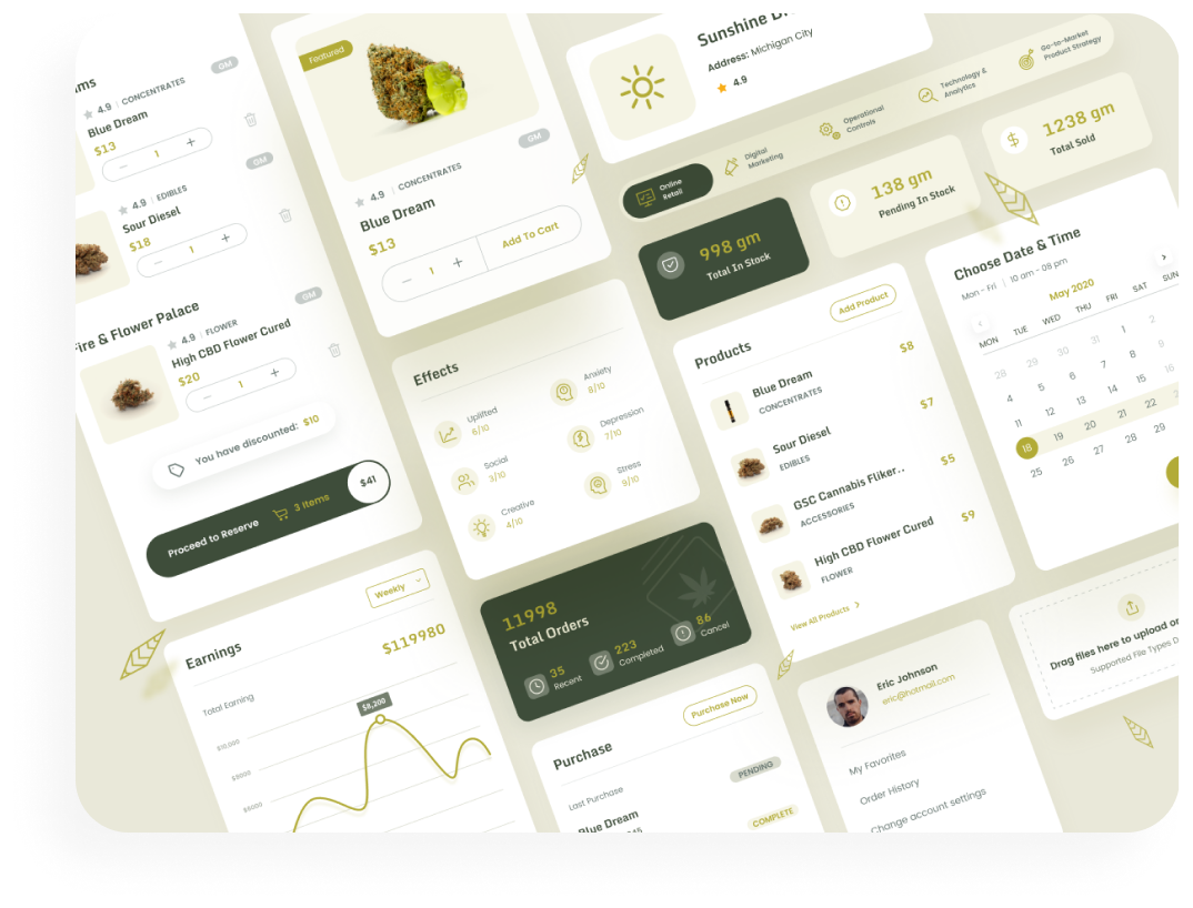
My Remedy App is an innovative solution to the procurement of cannabis. Its mission is to provide a platform for end-users, store owners, and producers to connect, purchase and sell products in a smooth and efficient way. In addition, user reviews are collected to develop a unique algorithm that helps suggest the best product for a user’s desired goals and intentions of use.
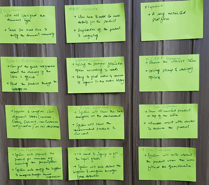
Research
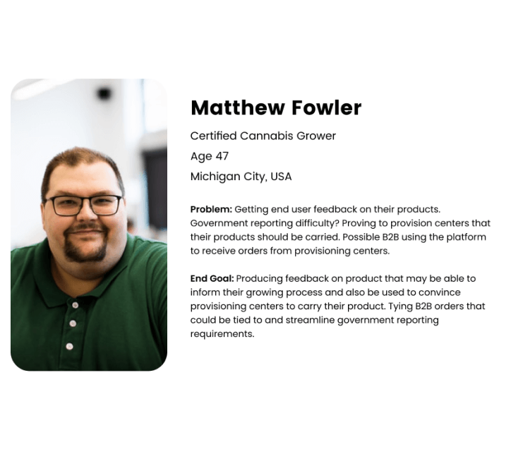
User Persona
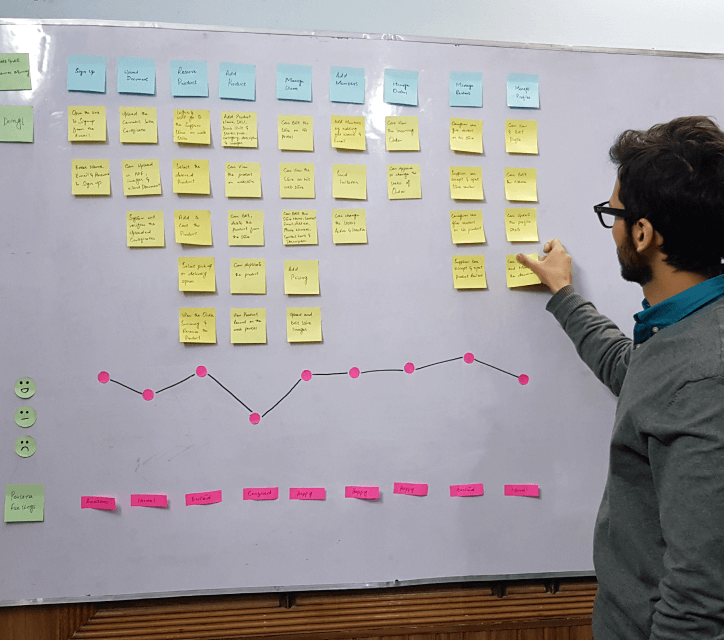
User Flow
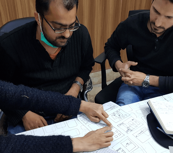
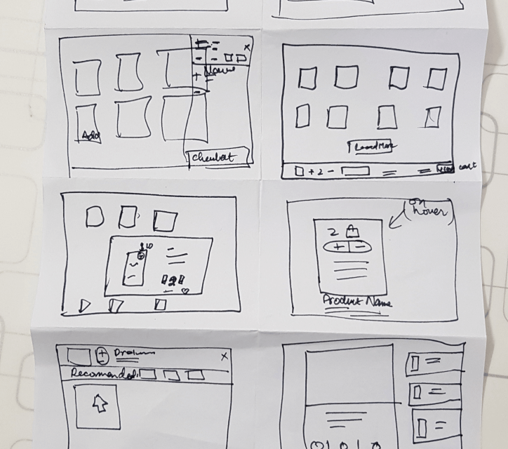
Wireframe
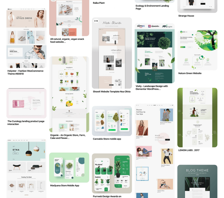
Visual Design
Prototyping
To make the design effective and tested to be user-friendly, completed different stages of the design process. Beginning from the problem statement and finding and sketching out the solutions for the concept after doing research. Wireframing and testing it with the users, iterate and completing UI design, and making a prototype. Giving the app to real users for testing, and finally by launching the app.
STEP 1
Problem & Process
The marijuana industry is expected to be worth $77 billion in the United States by 2022, and roughly $8.2 billion dollars in Canada within the next few years. Besides its popularity as a recreational drug, it’s being used in the treatment of chronic pain, cancer, Alzheimer’s disease, arthritis, other neurological conditions, and much more.
Kevin is an entrepreneur, long-time cannabis grower, and founder of Remedy. He saw an opportunity to digitize his business and simplify the sales and purchasing process for growers, dispensaries, and consumers.
01 Understanding the User
In order to experience the true benefits of marijuana, a user must understand its medicinal properties. This is because there are hundreds of strains, each of which has its own physical response and recommended uses. Unfortunately, the internet is brimming with misinformation and media spin making it very difficult for interested buyers to understand the best product for their needs.
02 The Design Sprint
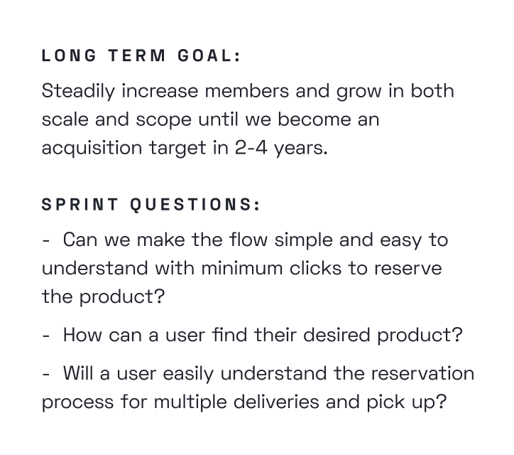
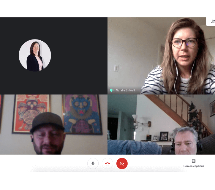
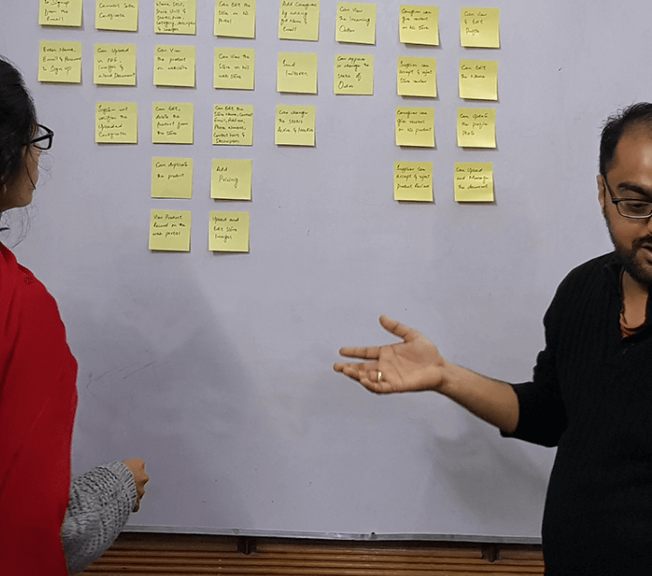
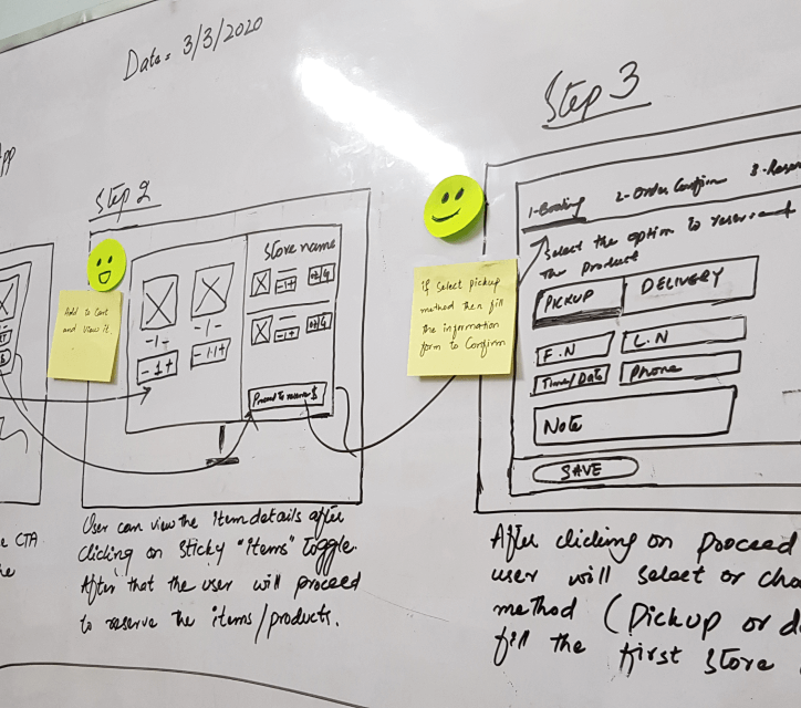
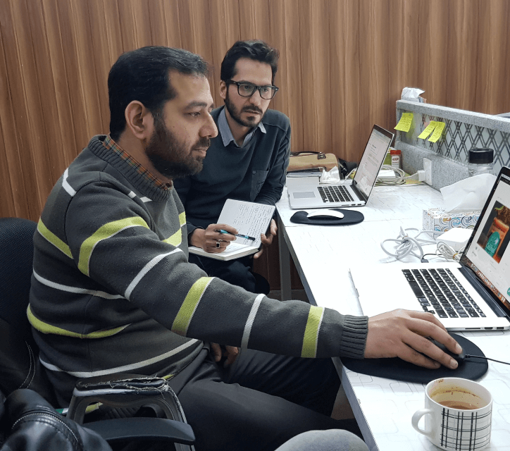
To answer the burning questions about this business sector and to guide a user to reserve the products with ease, we conducted the design sprint and tried a design prototype solution which we presented to the user and stakeholders. After several iterations, the end result was well received and appreciated.
03 Complete Design Solutions
We have created all design solutions including logo, branding, wireframes, UI design, prototype, marketing website design, and the design system. The full design phase took more than 6 months from research till the final product design. After several iterations, we moved the design screens to the development phase.
STEP 2
Design Sprint
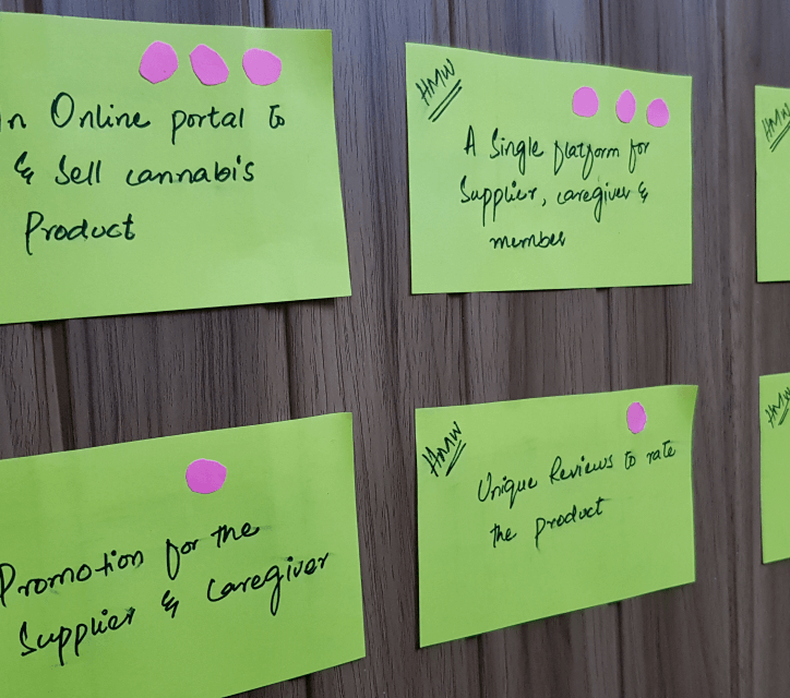
A design sprint is a five-day process for answering critical business questions through design, prototyping, and testing ideas with customers.
Day 01 - Monday
Day 02 - Tuesday
Day 03 - Wednesday
Day 04 - Thursday
Prototype
Day 05 - Friday
Usability Testing
STEP 3
Branding Design
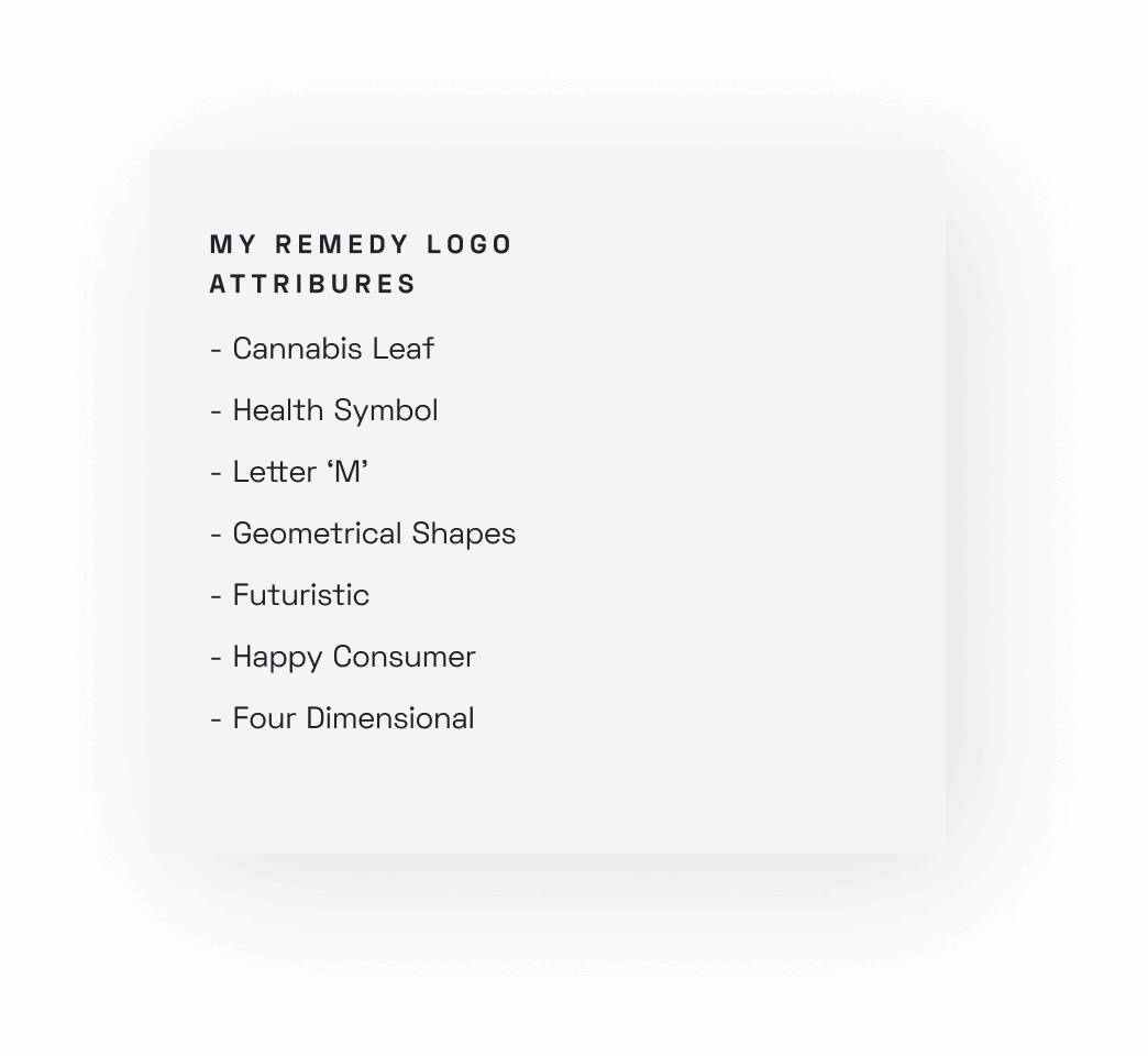
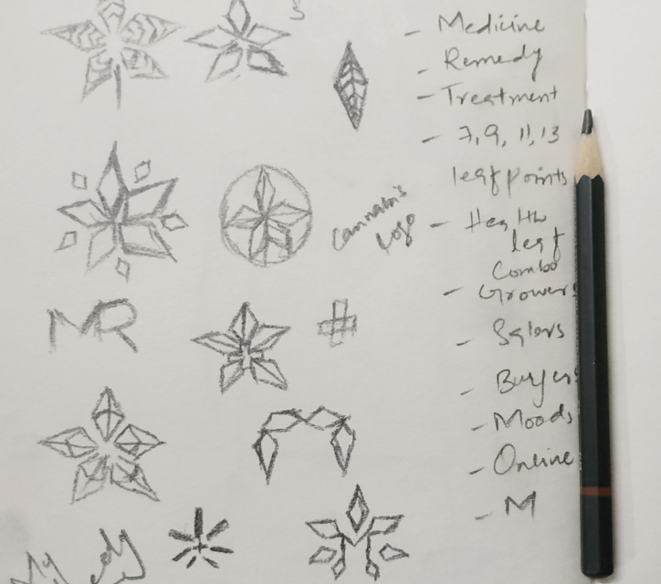
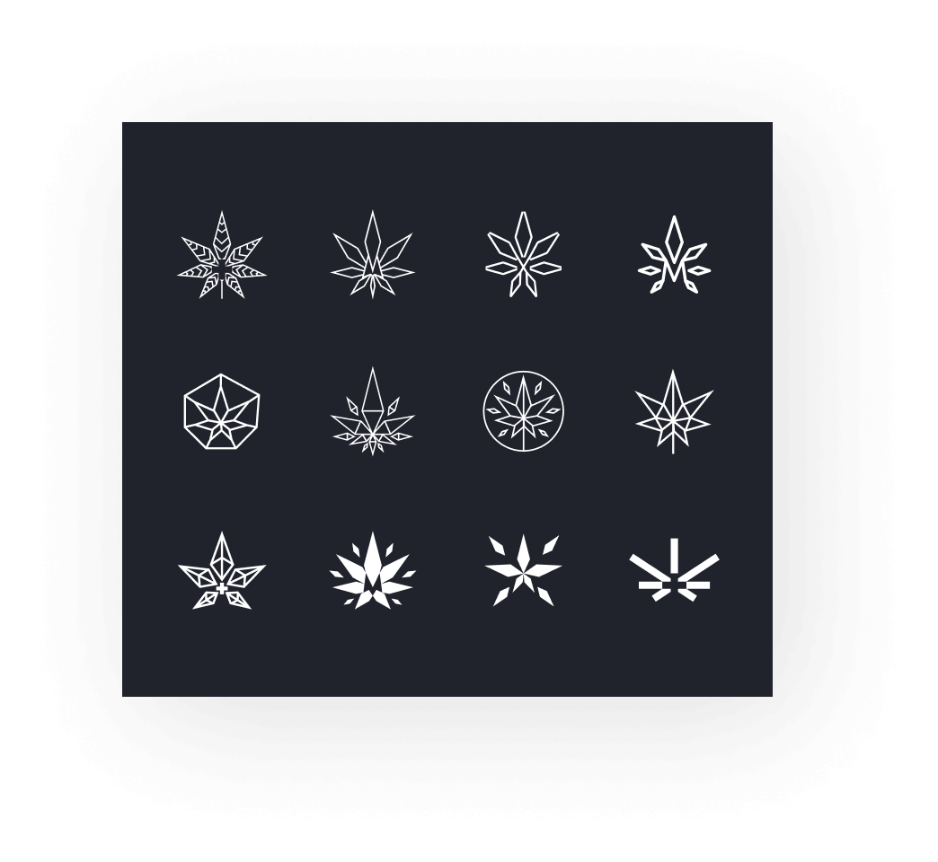
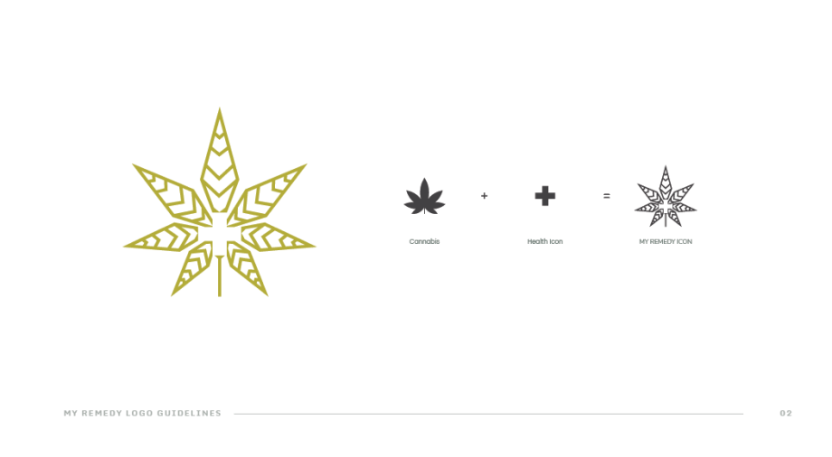
Once the sprint is completed and the design solution was decided, it’s time to work on the logo/branding material. The deliverables were the logo and the logo style guide which the client can use in different places.
STEP 4
High Fidelity
Wireframe
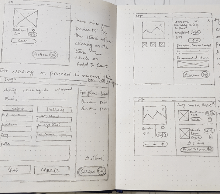
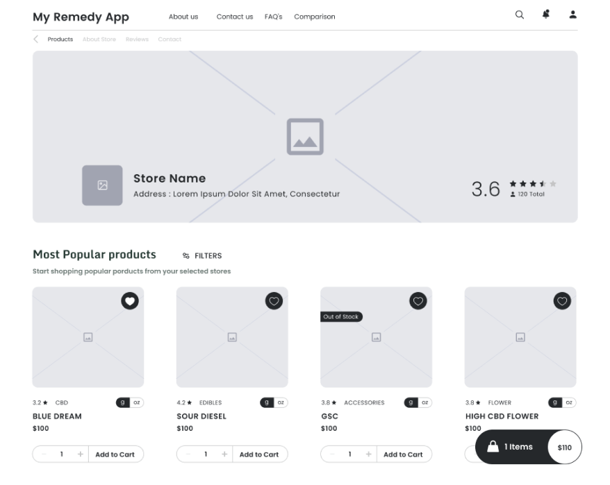
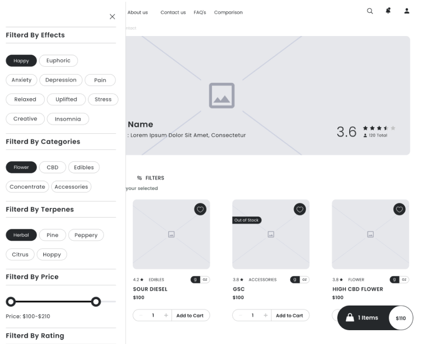
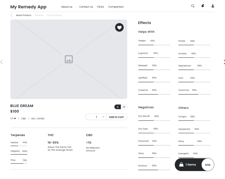
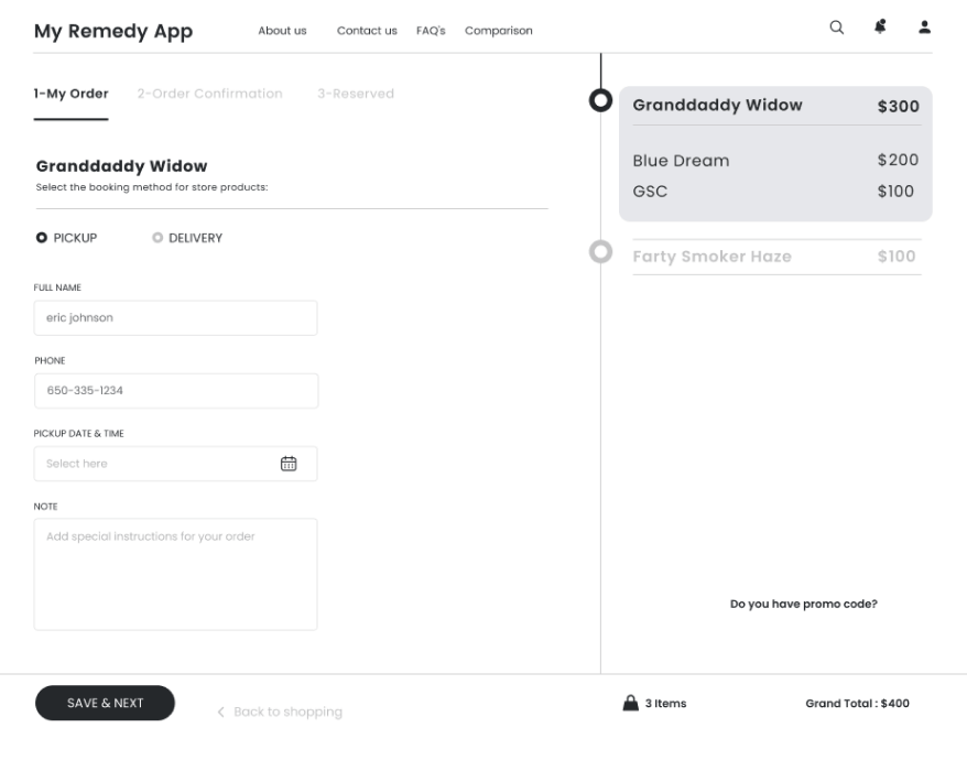
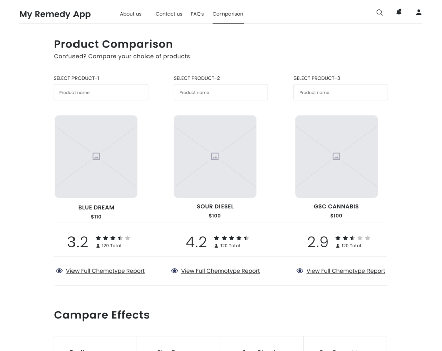
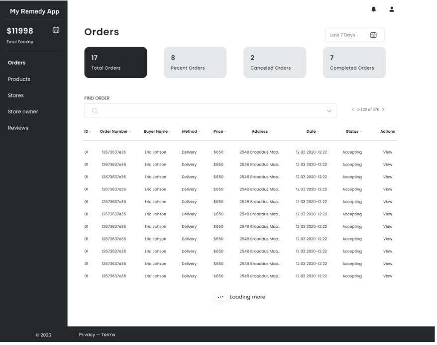
The high fidelity wireframes are important to show the content, information and for structuring the basic layout. It really helped in the UI design part and for user testing of the initial solutions.
STEP 4
UI Design Solutions
Once the features and functionality of the application decided, the next step was to work on user interface design and then prototype it so the stack holders and users can use it and give their valuable feedback.
Typography
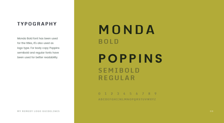
Monda and Poppins-type families were used for better legibility and uniqueness.
| H1 | Monda Bold | 38pt |
| H2 | Monda Bold | 32pt |
| H3 | Monda Bold | 24pt |
| H4 | Monda Bold | 20pt |
| H5 | Poppins Regular | 16pt |
| P1 | Poppins Regular | 16pt |
| P2 | Poppins Regular | 14pt |
| P3 | Poppins Regular | 12pt |
Iconography
Simple and meaning full icons have been created for accomplishing intuitive design.
Color Palette
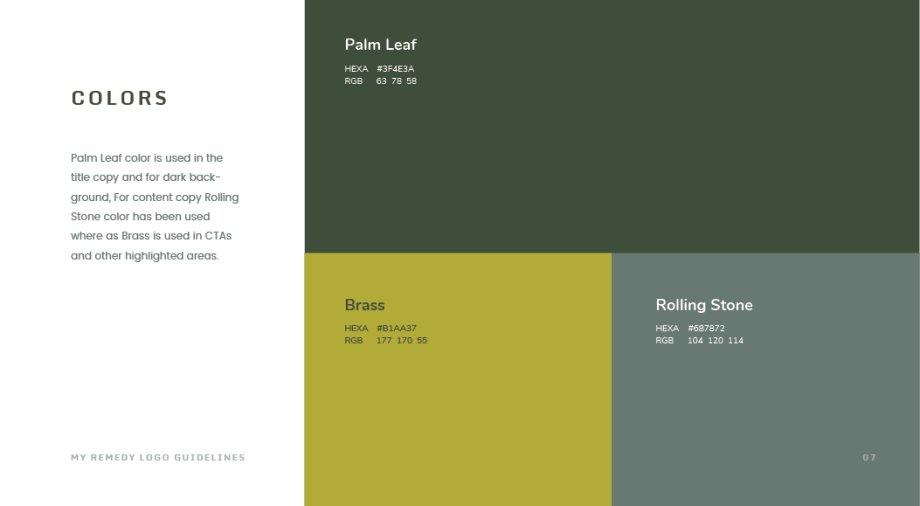
Brand colors have been used with a lot of white spaces to give the app a neat look and for a better user experience.
Visual Design
Kept the design simple and visually appealing by using a minimalistic design approach. As there were a lot of features that’s why the aim is to make it simple and easy to use with less or no cognitive load.
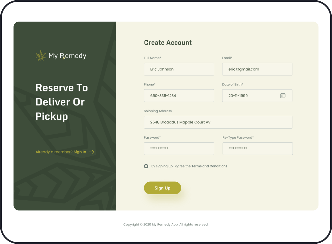
ONBOARDING
Onboarding the grower and supplier to the platform.
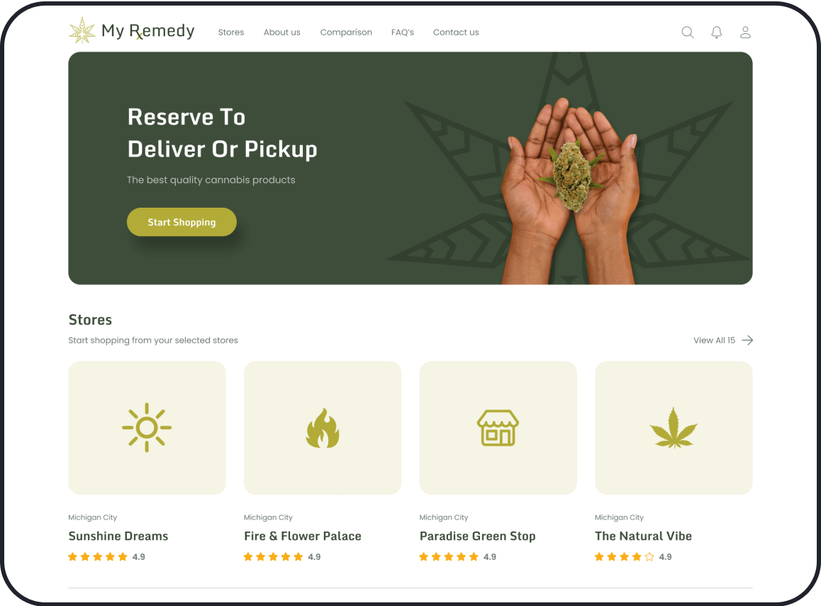
HOMEPAGE
Home for stores, and their products for quick access.
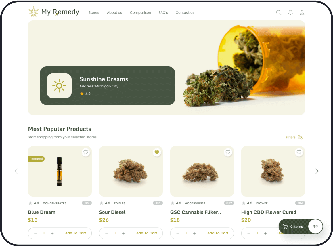
STORE
Store owner page where they can sell their products.
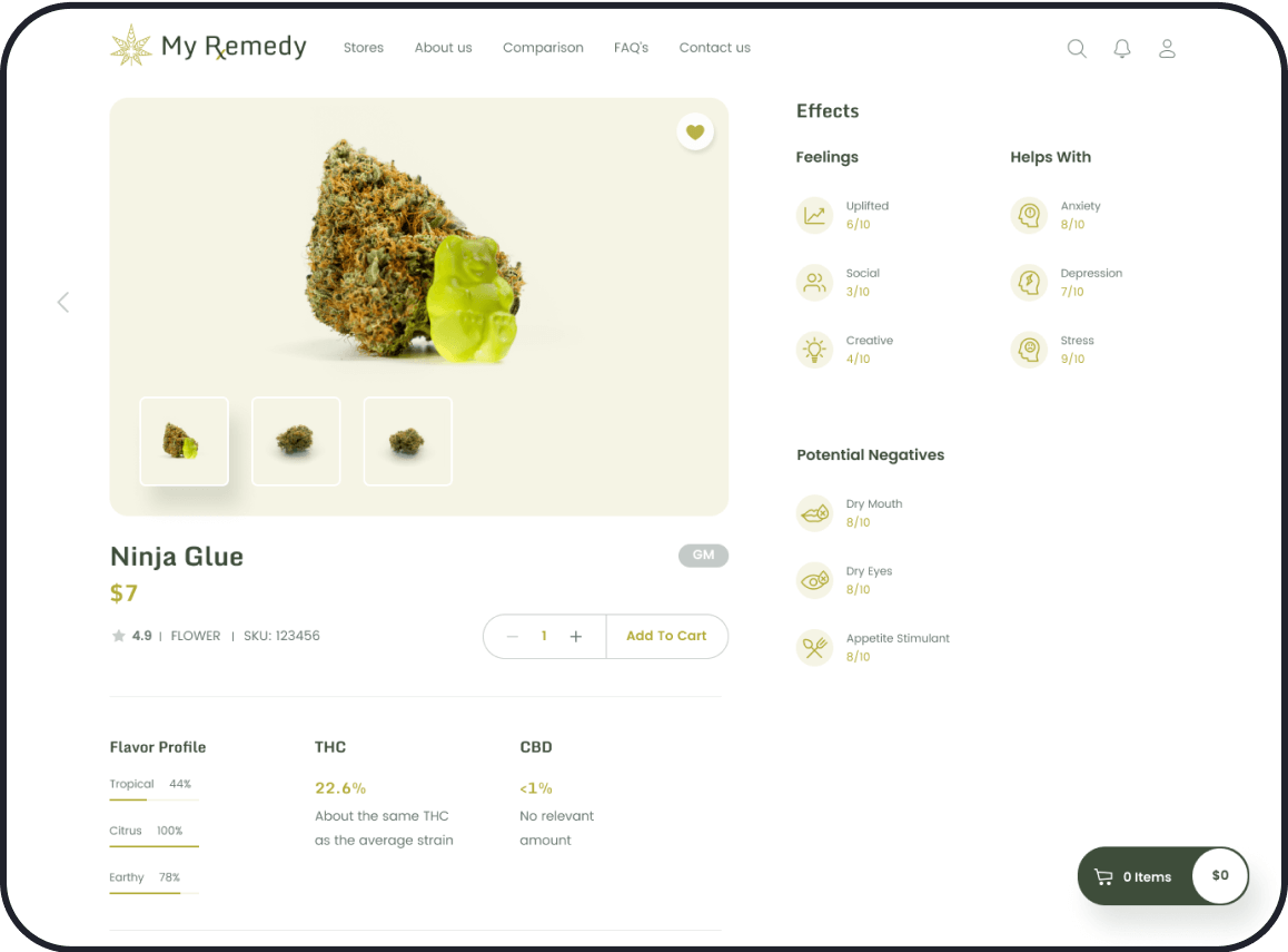
PRODUCT PAGE
Cannabis product detailed information with reviews.
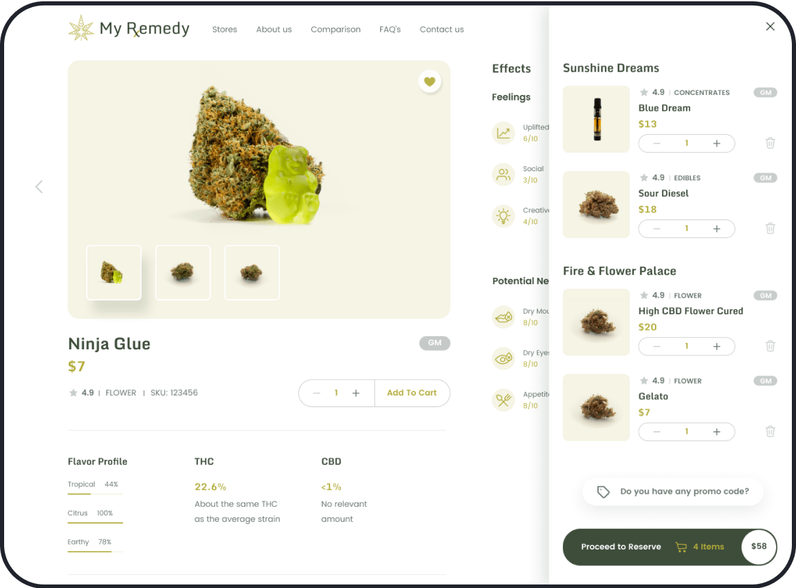
SHOPPING CART
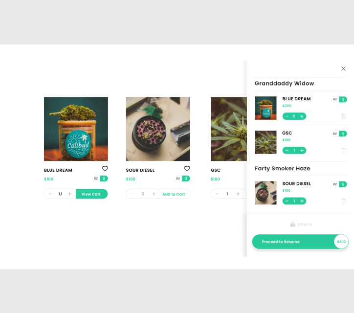
Easy to add and remove from the shopping cart.
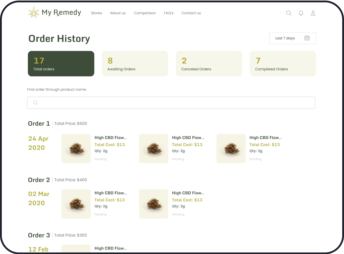
ORDER HISTORY
Track your orders and reorder your favorite products.
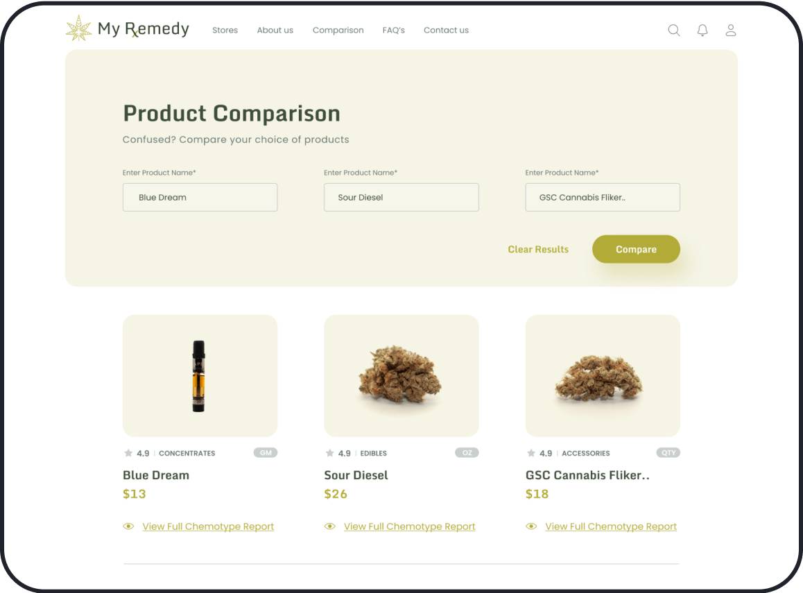
COMPARISON
Easy way to compare and know the product in detail.
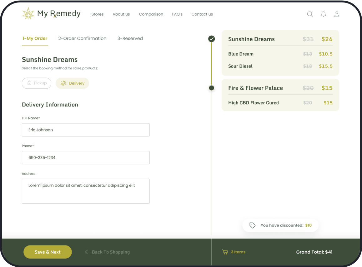
CHECKOUT PROCESS
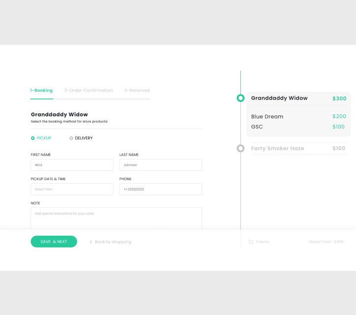
Reserve the products with delivery or pickup options.


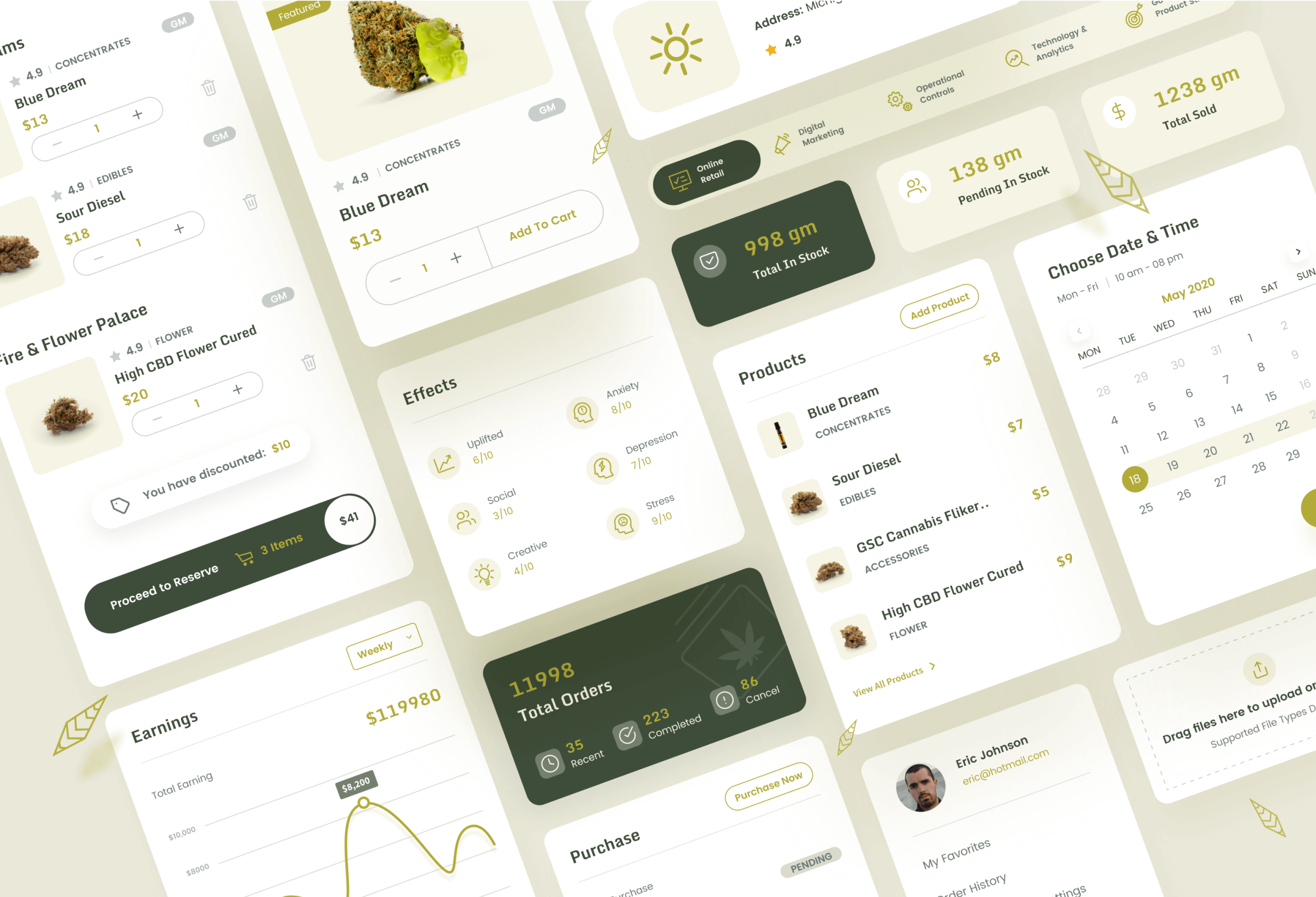
Design Elements
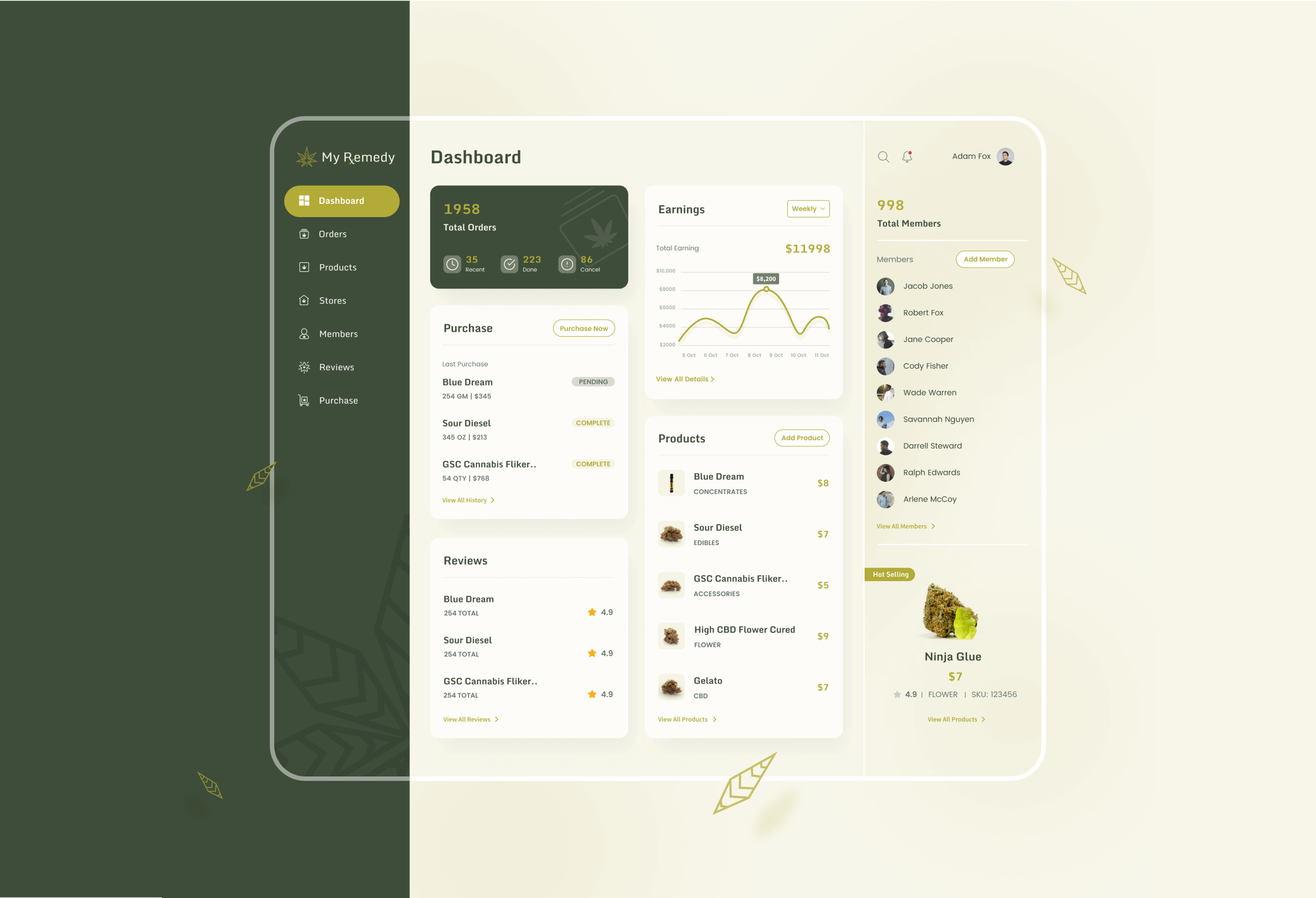
Dashboard
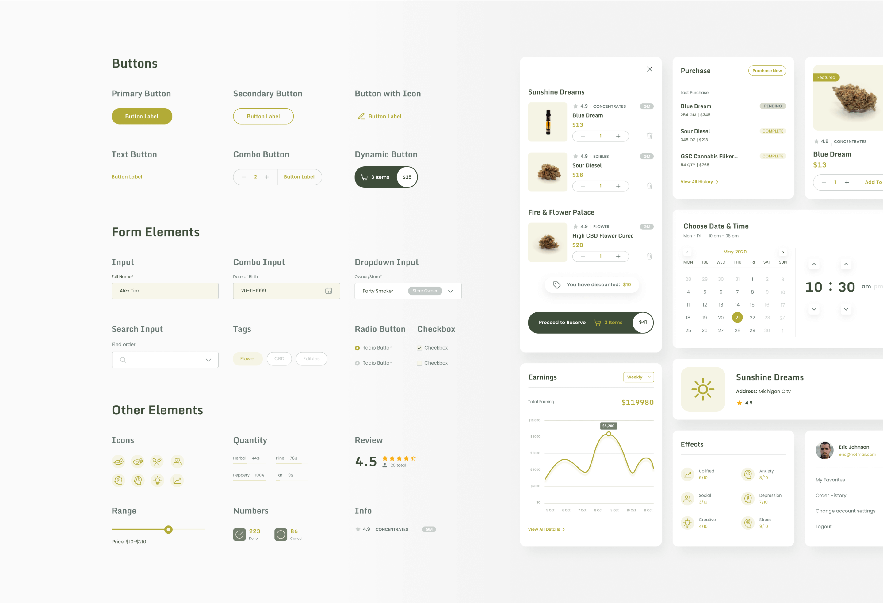
Design System
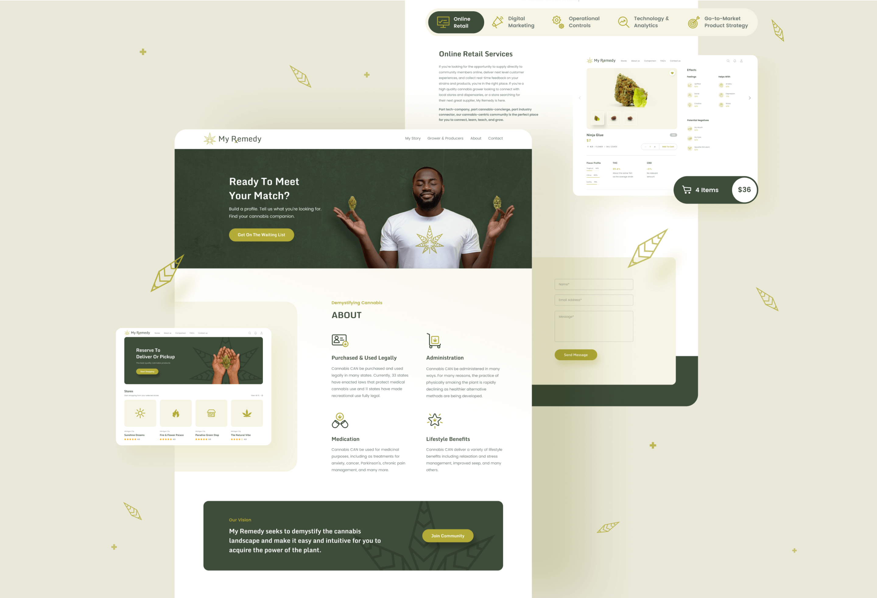
Website
Summary
Working in close collaboration with the whole team, we were able to deliver a real-life marketplace app experience for unique users. While user testing a large number of users found it easy to add or remove the product with one click which we focused on while working on the user experience. The process to reserve the product for delivery or pickup options is well received by all stakeholders and they understand the reservations process easily which was also our sprint goals.
The dev team worked on an algorithm that can make product recommendations based on a customer’s desired outcome (i.e. better sleep, relaxation, increased energy, etc.) which helped building an app that paired a knowledge base covering the nuances of hundreds of products.
The Numbers
100+
Selected No. of Users
150+
No. of Screens
2021
Year Launched
2
No of Design Sprints
6
Timeline (Months)

